Prototyping/Testing
Nov 21st, 2013 by bernsj2
Prototypes
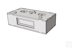
Prototype version 1 was a box that contained a small two-row screen, two pushbuttons, two circular indents, and a spot for an operator piece. Fraction pieces (in thirds and quarters) were cut out of acrylic to represent parts of a whole. Pieces of each type could be stacked upon each other, and then on top of one of the input circles. The operator slot accepted one of four acrylic operations (+, -, x, and /). This left the student with a fraction problem to solve. For example, if they placed two thirds pieces, a multiplication operator, and three quarters pieces, the screen would display (2/3) * (3/4). The students then worked both independently and together to solve each problem, then they would press the button and the answer would appear on the screen. The bot worked by designating pieces of each type of fraction and operator to contain a resistor of a uniform value. As these pieces completed the circuit inside the box, the Arduino could read the resistance value to determine which type of piece each was, and based on the combined resistance of stacked pieces, how many pieces were in the stack. We received positive feedback on the prototype.
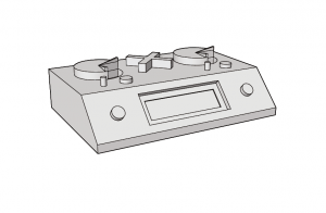
Version 2 of the prototype was never built, but was an idea meant to better represent a wider range of fractions. This prototype contained many of the same functions as the first prototype, but instead of stacking cylindrical fraction pieces, two pie-shaped potentiometer knobs could be turned to increase or decrease the fraction of the whole to be represented. The screen would have read the fractional settings in real time. While this idea would have allowed the students to visualize how fractions represent parts of a whole, it did not challenge the students to find their answer in an interactive or engaging manner. Without an interactive answer option, this prototype would have been a visually appealing, but functionally complicated calculator.
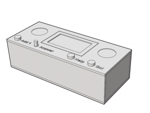
Version 3 of the prototype was most similar to our final design. This design was first presented and tested to our classmates before making some final changes and garnering feedback from the students in our final field visit. This prototype contains an expanded four-row digital LCD display. The Arduino is pre-programmed to generate random fraction questions and the screen was interactive with the buttons. The answer pushbutton/potentiometer can adjust the fractional answer to the provided question and upon a press of the Go button, the screen displays whether the answer is correct or incorrect. One change beyond this prototype that the final version contained was two LEDs in the circular cutouts. These LEDs flashed a sequence of colors while the microcontroller generated a new question, and flashed green for correct answers and red for incorrect answers. This prototype was constructed out of wood and imprinted with a laser cutter. This was due to a student suggestion that we use wood instead of transparent acrylic.
_________________________________________________________
Field Site Visits
In order to test our ideas, we visited with the students on two different occasions to receive feedback on the usability and effectiveness of our prototypes.
Field Site Visit #2 (after market research)
Date: 10/10/2013
Location: Ark Community Charter School, Troy, NY
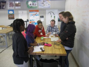
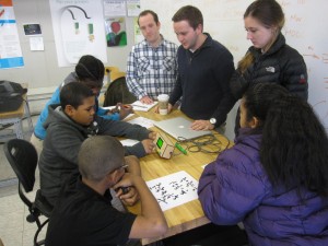
At our first field site visit for prototyping purposes, we set out to observe students as they interact with the device, in order to both see how intuitive our idea was and also to get a better understanding of the students who would be using our device. For this visit we brought Prototype #1 along with us. We found that the students were not only engaged with the device, but the fact that there was only one device for several students left the students helping each other to solve for the correct answer. Testing became easier once the students were provided with personal dry erase boards to write out their problems. We were impressed to find that the students got competitive to solve the questions faster than their companions. The fraction problems seemed to be a good challenge, as some students excelled quickly through the problems but others took more time and attempts before getting the questions correct.
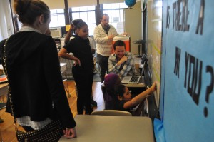
Students perform fraction arithmetic on the white board before checking their answer with the Fraction Bot prototype
One finding was that our prototype allowed for a larger fraction to be subtracted from a smaller one, resulting in a negative number. The Fraction Bot could handle the arithmetic, but the concept of negative numbers–and especially of negative fractions–is foreign to most 6th graders. We determined that this would need to be fixed before our next field visit. One of the most beneficial things we picked up from the students was their explanations of how they are taught to do the math. For example, most students are taught to divide fractions using the “Keep-Change-Flip” method, which instead multiplies the reciprocal of the second fraction for simplicity. These students learned a mnemonic device for this method, called Kentucky-Chicken-Fried. As 6th graders are often fans of fast food like KFC, we can understand how this is easy for them to remember. Learning their methods such as this assisted us later on as we added guided assistance functions to the Help button.
Some additional feedback from the visit:
- “…would enjoy having a display”
- “More fraction pieces”
- Students wish each side could handle fractions greater than 1 (mixed numbers/improper fractions)
- Most of these skills were taught in 5th grade, but it was apparent that some benefited from the review
- Students would like it to handle “any math problem”
- Would like it to handle two operations at once
- Would enjoy an improved visual analogy, such as our suggestion of pie slices
______________________________________________________________________________
Field Site Visit #3
Date: 10/31/2013
Location: Programs in Design and Innovation Studio, Sage Laboratories, RPI, Troy, NY
For this testing phase, the students visited us in our innovation studio. They were excited to visit a college campus, as each of the previous times we visited them they flooded us with questions about what it was like to be in college (they seemed even more ethnographically inquisitive than we were during our first visit). For this testing session, we provided them with a modified version of the first prototype, this time with more fractional pieces. For simplicity and robustness, we removed the addition and subtraction options. Similar to our previous field visit, the use of dry erase boards helped make the learning experience more interactive for the students.
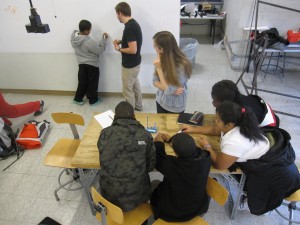
A student explains how he arrived at his answer while the rest of his group watches, prior to testing his answer
Since the students already had an expectations of what the device would be from the previous field visit, they had some more critical feedback for us. They liked the ideas that we pitched to them, though we would have preferred some resistance to our suggestions. They asked us to program instructional messages into the Help button, which did not function at the time. Some students asked us to make the bot more like a game and wanted the ability to input a guess answer. We observed that some students toyed with the pieces and tried to insert fraction pieces in the operator slot. While we were able to give them instructions on proper use, we decided that we should design the bot so it could not be used incorrectly, and such that proper use was as intuitive as possible. One unforeseen challenge was that two of the fraction pieces broke during the first round of students, so we had to spend additional time attempting to fix the pieces and improvising an alternative use for the students.
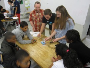
Team member Krista instructs a new group of students how to use the prototype. Moments later they were using it on their own.
Students also made the following suggestions:
- They are currently studying decimals, so a way to practice decimals as well would be helpful
- We should use a different color (or multi-color) screen
- The bot should verbally communicate–perhaps even hold a conversation
- We should build a lot! of fraction pieces for next time (perhaps students would like to build a tall tower)
- It should handle a wider range of fractions
- It should be solar powered
- We should add + and – functions back to the prototype
- It should flash lights and play hip-hop music upon a correct answer
- It should distribute money or write a check when student is correct (apparent preferred motivator)
- If incorporating decimals, we should make it a change machine
Some additional observations we made were that students have a more difficult time with word problems, so practical visualization of the fractions and/or decimals would be helpful.
An interesting suggestion came from a couple different students who agreed that they did not like the clear acrylic of the prototype. They did not enjoy seeing the internal components of the device and would prefer it to be made of a nice type of wood. This surprised us from an ethnographic perspective as our team had all grown up in an era when many electronics used translucent or semiopaque materials to showcase the internal components as a novelty. Upon further reflection we realized that these students were born into an era of minimalist electronics design, characterized by Apple products like the iPod and Mac Book. Even despite our 10 or 11 year age difference, we became aware of the distinct shift in design philosophy that occurred over the last decade.
______________________________________________________________________________
Field Visit #4 (Delivering to the Students)
Date: December 2, 2013
Location: Programs in Design and Innovation Studio, Sage Laboratories, RPI, Troy, NY
For the final field visit from the Ark students, we presented the students with our final iteration of the Fraction Bot. Much more robust than the previous models, the final Fraction Bot correctly answered all but one question, which was correct but did not reduce properly. We incorporated as much of the previous feedback as possible, adding LEDs that flashed a sequence of different colors during a correct answer, a bigger screen that could display fractions across three rows, a series of guided hints from the Help button, and a sleeker, simplistic casing that hid all of the internal components of the device. The primary difference was the addition of an answer input. A combination pushbutton/potentiometer enabled students to easily adjust the fraction on the screen; to increase the numerator by one, they pushed the button; to increase or decrease the denominator, they rotated the potentiometer. The button/dial functions were initially reversed, but changed at the last minute as we realized the denominator often required a greater variation and the potentiometer changed the values more quickly than the pushbutton. An Add 1 button premiered with this design, which added one whole integer to the answer and enabled students to practice their mixed numbers.
From observing the students, we gathered that the final design was pretty intuitive. Students understood its use with only a brief initial instruction. We noticed that the bot continued to be more engaging for individuals than for groups, but it still invited group collaboration. Since our code only allowed for one correct answer, we required that fraction answers be in simplest form to be recognized as correct. This caused some confusion, but ultimately required the students to practice their ability to reduce fractions. Fraction reduction skills seemed to be even more of an appropriate challenge than the arithmetic itself. Students seemed to enjoy the fact that the new design included four levels that each required five correct answers before advancing to harder questions. At one point, the Fraction Bot needed to be reset and several students were upset that they had lost their level progress. While it was unfortunate that the glitch occurred, it showed us that the students were emotionally engaged with the device. We were surprised to find that, despite programming three progressively helpful hints into the Help button, the students were less dependent on the button that we had expected.
Some additional comments we received from the students during this visit:
- “Everything is better” than last time
- “I prefer this to writing out problems by hand or on the board”
- “I like the new flashing lights”
- Upon first sight of the bot, “I already like this better”
- “I would pay $5 for this”
- “We need this for school. You guys should sell this”
