Prototype 2
Dec 8th, 2016 by hutenj
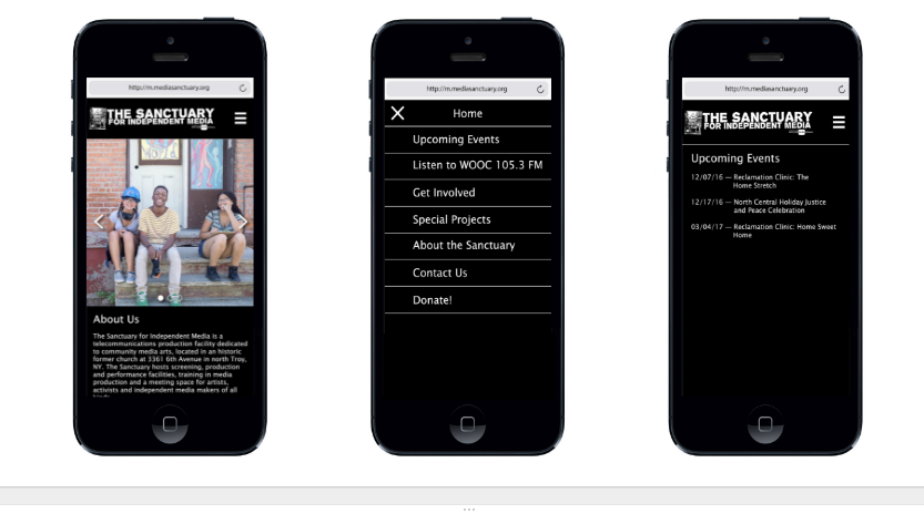
The second iteration took the visual style of the full Sanctuary website and developed a cleaner and more intuitive interface for mobile devices. The landing page prominently features a sliding carousel of images from the organization’s social feeds. Below the images is a brief description of the Sanctuary’s goals and mission to make that information clearly accessible to site visitors. The rest of the information on the site is accessible through a hamburger menu in the upper right corner. The goal is to clearly present the necessary information in a way that flows well on mobile devices.
An interactive visual mock up can be found here: https://invis.io/KD9LOACMC
User Testing and Feedback
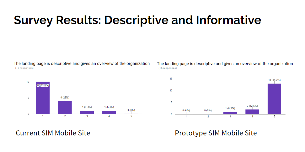
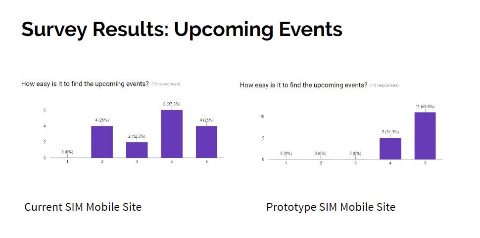
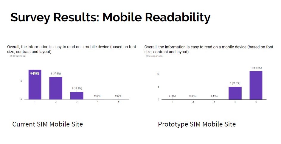
To gather feedback on the second iteration, we conducted AB testing to compare the current site as viewed on a mobile device with our prototype. As the testers interacted with both versions, they filled out a survey that asked them to evaluate their experience. A selection of their responses are shown below.
Changelog
Based on the feedback gathered through the survey questions and open ended responses, there were a number of improvements we decided to incorporate into the next iteration. A brief summary can be found below.
- Added more visually appealing photos
- Added missing visual cues
- Poor indicator showing that upcoming events had another layer of information accessible to users
- Lack of obvious exit button after clicking on projects
- Expand home page information & visuals
- “The home page could use a little more. It’s too short. I’d like to see some projects on there that represent the Sanctuary so that I am interested in digging past the first page.”