Initial Designs
Dec 1st, 2014 by ioanna2
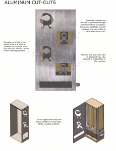
Aluminum cutouts in the vending machine would allow the condoms to be seen from the outside. The fear was that people would stick their fingers in the cut outs and steal condoms. If there was a piece of clear plastic behind the cut outs, there was a fear that it would yellow with time making the machine look less appealing.
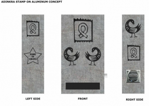
Stamping adinkra designs directly onto outer aluminum of the machine. Would be screenprinted.
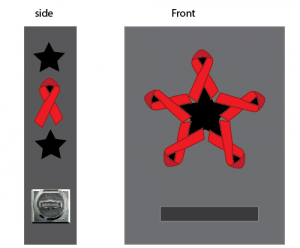
Aids ribbon and the black star. The fear is that too much connection between HIV and condom use would turn potential customers away.
This design could be screen printed or done via stickers.
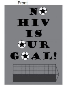
Soccer is an extremely popular sport in Ghana so we were looking into using soccer to attract more people to the machine.
The English wording was a bit awkward and we were unsure if it would actually attract more people. Again, the connection between HIV and condom use could potentially turn customers away.
This design would be done using stickers.
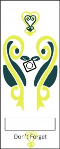
The sankofa is an adinkra symbol that means “reach back and get it”, from this the stylized heart sankofa’s message is”don’t forget to go back and get a condom”. The heart was cut in half to look like 2 birds carrying a condom in their mouths, which is symbolic of the shared responsibility to teach and practice safe sex.
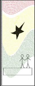
When brainstorming, our group came up with some words that we would want to associate sex and condom use with. Not disease or fear, but “security, love. trust. family. safety. care. affection. protection. faith. consideration. responsibility.” The word condom is also worked in amongst these words to give the user an idea of what the machine is selling. The words are in Ghanaian flag pattern.
How to refill the condom vending machine. We want this on the inside flap of the machine to give whoever is taking care of the machines instructions on how to refill the machine properly.
We toyed with the idea of putting how to properly use a condom on the side of the machine. However due to the embarrassment factor we feared that this would scare away potential customers and make them more shy and not want to approach the machine. Our goal is for the machine to be as approachable as possible.
