Prototypes and feedback
Dec 3rd, 2014 by ioanna2
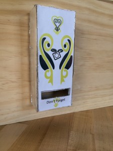
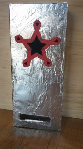
- “I don’t know the symbolism of the heart style but the condom in the middle and dont forget at the bottom are good design choices. You know what the machine is more subtly”
- “cute, i like that it’s not about health here, but I think you just need to value through their culture/values what the right approach is. I would look at the most successful marketing techniques in Ghana and mimic those approaches. (health, love, safety, aids prevention, etc)”
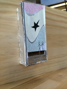
- “I really like the words! …the little stick guys seem plopped on there I think they would look more natural if they were morphed in like how the star is…maybe have the two stick figures holding a condom between them?”
- “I’m not sure how much this implies “there’s condoms in here” but I’m also not sure how much is appropriate or what you’re aiming for. If everyone already knows that it’s for condoms that’s fine.”
- “would the condoms be exposed?”
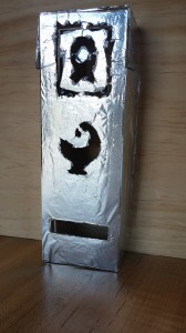
- “The cut out one is an interesting idea but it is empty behind and unless you have an extra layer people could theoretically steal them or cut their hands on it. It could also have worse structural integrity and break down quicker, which was the problem they were experiencing if I remember correctly”
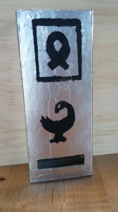
- “I’m concerned with people automatically associating this with aids (and that that’s negative i guess?)”
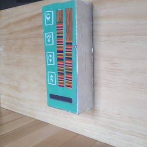
- I like the look of it. the ribbons seem glued on so it looks a little less natural compared to the purely painted design which takes away a bit of the charm.
- “This is a lot cleaner than the cut out design and kind of goes along with the printed Adinkra ink idea. I like it, it’s very clean. I think incorporating Audrey’s altered symbol could be cool”
- “looks cleaner and more natural. it fits more with the cultural adinkra ink stamp and kente cloth style”
- “What do these symbols mean to different people? That could alter how someone feels about it as much as the aids ribbon”
