First Iteration
Dec 7th, 2016 by garcis2
The project was first imagined as a system of informational kiosks strategically located around the Sanctuary for Independent Media and its surroundings. In this iteration, the system consists of one traditional two-dimensional kiosk at the main Sanctuary building which provides information about the kiosk system, the Sanctuary’s mission, and upcoming Sanctuary events. Several smaller kiosks are located in prominent locations. Unlike like the main kiosk, these smaller kiosks are not structured in the traditional way. Instead, they have the form of a classic tourist attraction tower viewer. When a passerby interacts with this tower viewer, however, instead of seeing a closer view of what is in front of them, they see a series of View-Master-esque slides highlighting interesting information about that particular location. Developed in conjunction with Sanctuary volunteers and residents of North Troy, slides might touch on any of a number of topics, including place-based history, local ecology, or promotional information for the Sanctuary. The viewer is able to click through the images in the same way that they would with a traditional View-Master, with captions printed on the physical reel to provide context. And at the end of each reel is be an additional slide inviting the viewer to visit the main kiosk for more information about the Sanctuary.
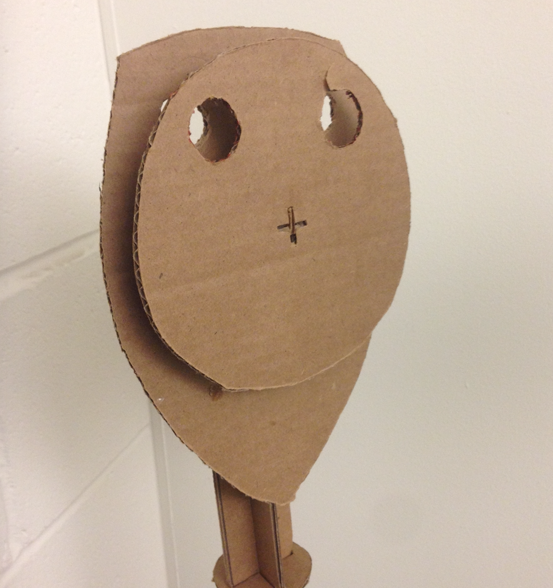
To help conceptualize the tower viewer kiosk concept, the group developed a rapid cardboard prototype of the kiosk’s physical structure (Figure 5). Modeled after the aesthetics of a classic observation deck viewfinder, the initial mock up had rounded edges and an iconic look.
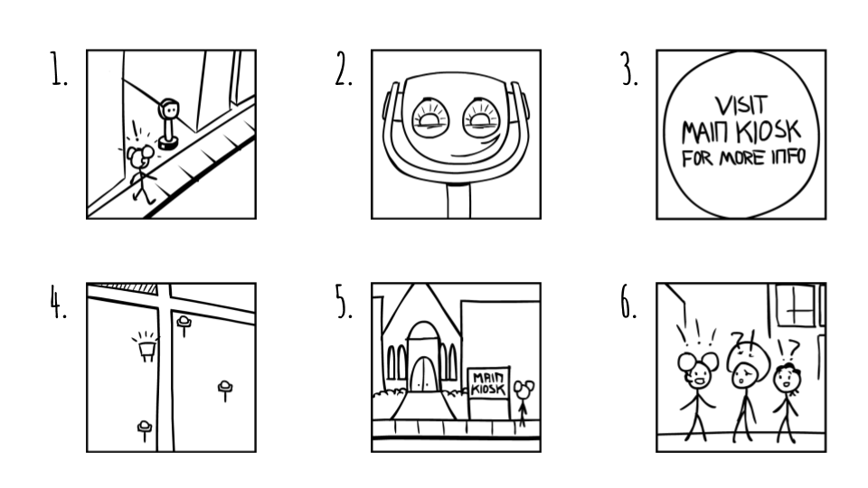
The group also developed a storyboard to further clarify the user’s experience with the device. This can be seen below (Figure 6):
Figure 6: Storyboard illustrating a typical user interaction. The target user, Stephanie, is walking around her neighborhood when she happens upon a tower viewer kiosk on the street. Intrigued, she investigates and finds a number of interesting facts about the area immediately surrounding the tower viewer. At the end of the slides is a call to visit the main kiosk for more information. After locating the main kiosk and doing so, she tells her friends about the positive experience, spreading information about both the Sanctuary and the surrounding neighborhood.
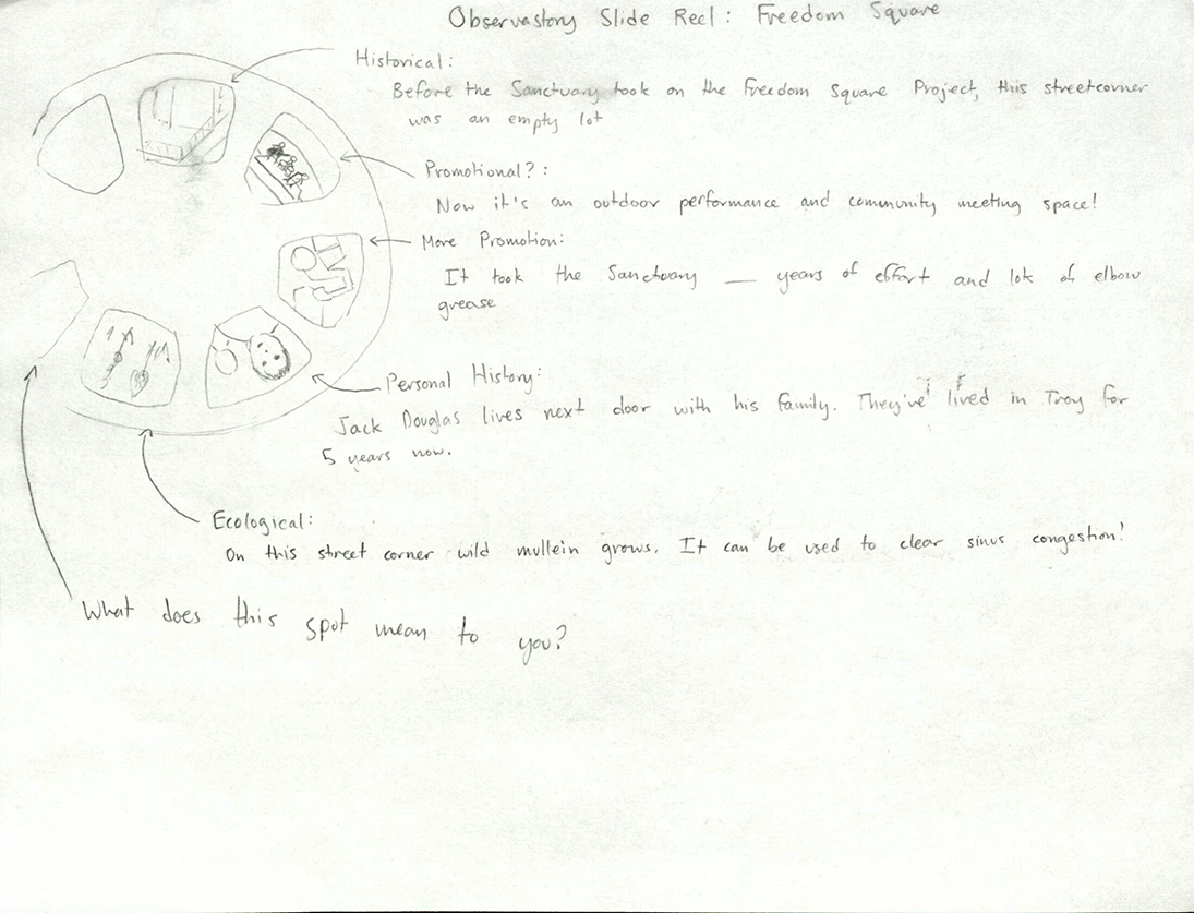
In addition to the storyboard and the physical design of the kiosk, the team also generated ideas for what type of content would go on the informational slides. The group envisioned the slides to have somewhat of a narrative, beginning with the history of the landmark, and then continuing on to more current events, detailing how the Sanctuary is involved, and possibly including more recent personal histories (Figure 7). The notes below use Freedom Square, an outdoor performance space at the Sanctuary, as an example location.

Figure 7: Sketch illustrating the Sanctuary reel appearance and layout.

