User Testing
Nov 17th, 2016 by presce2
Overview:
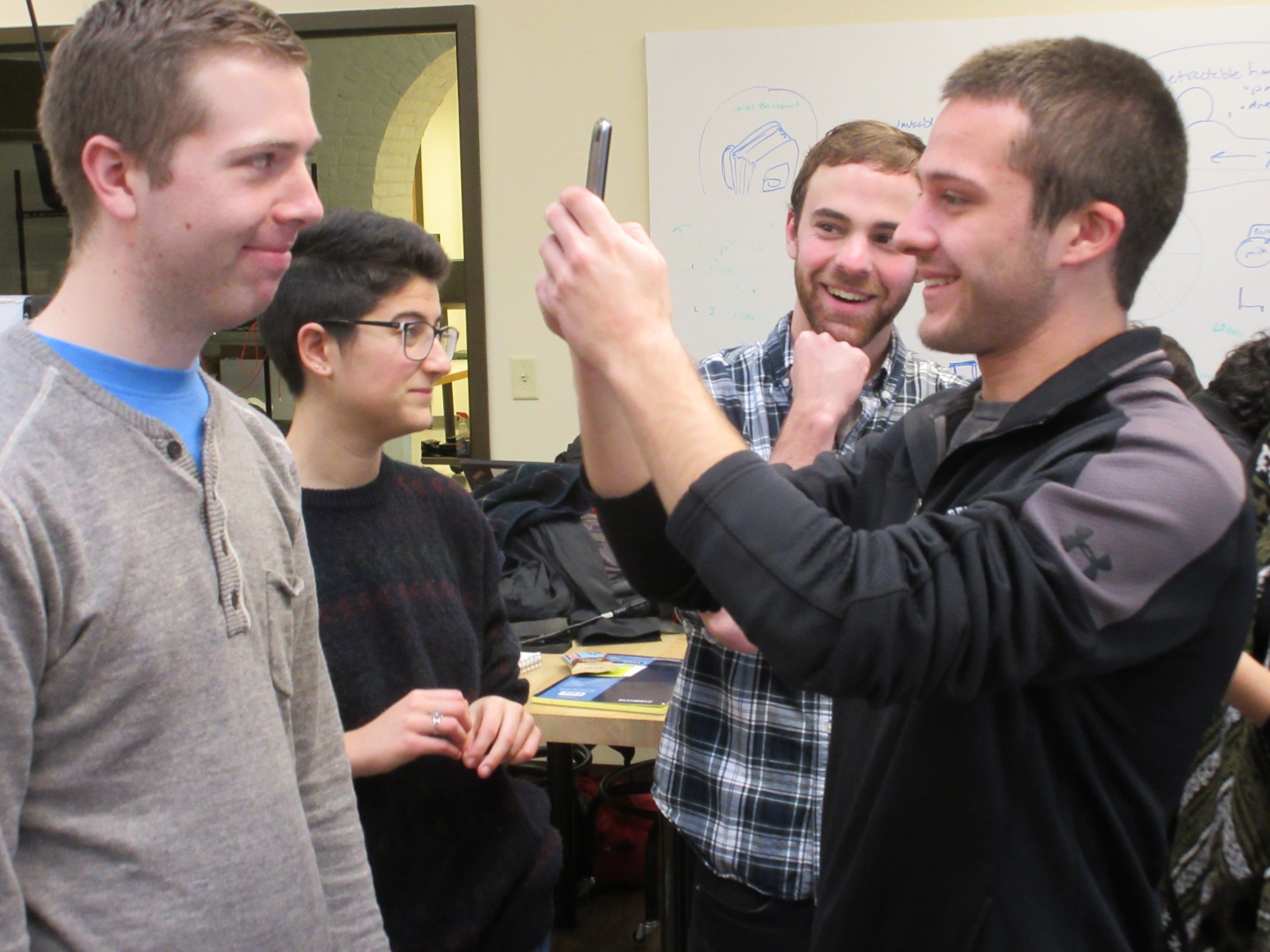
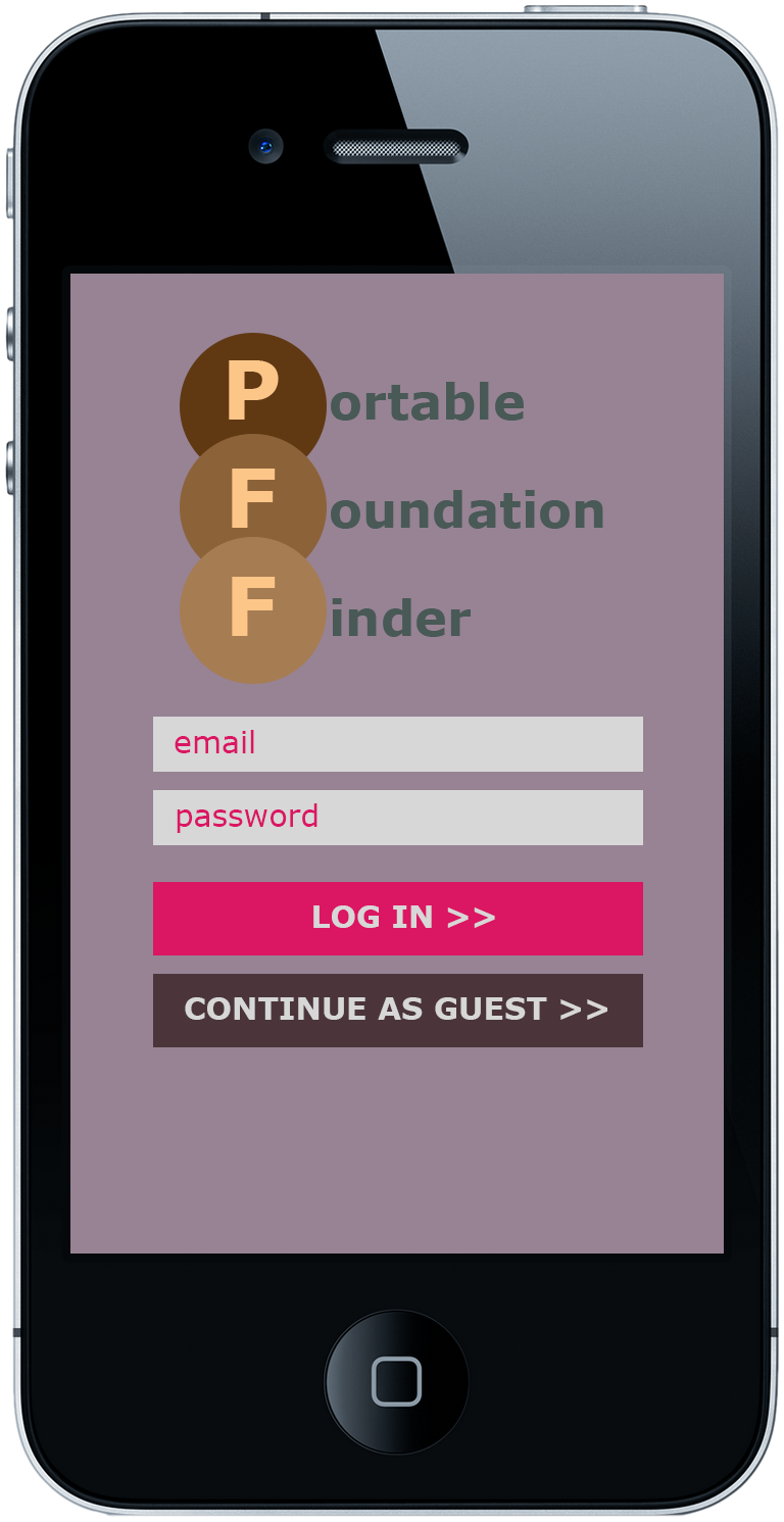
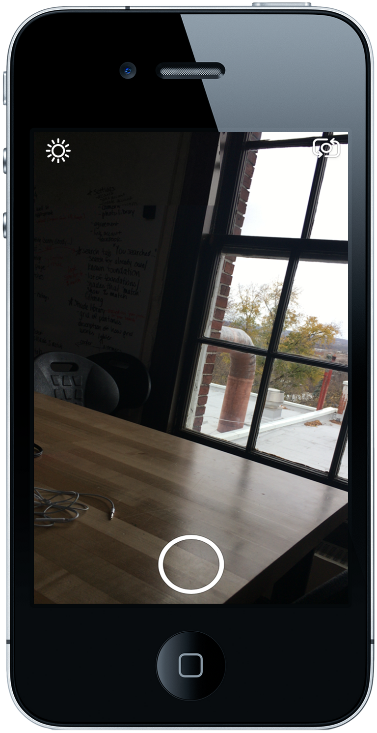
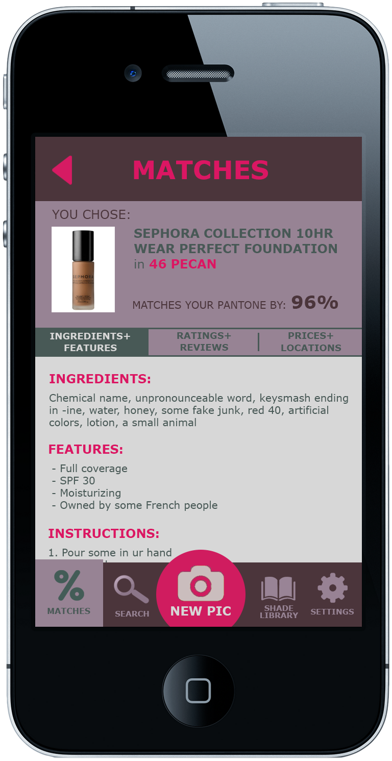
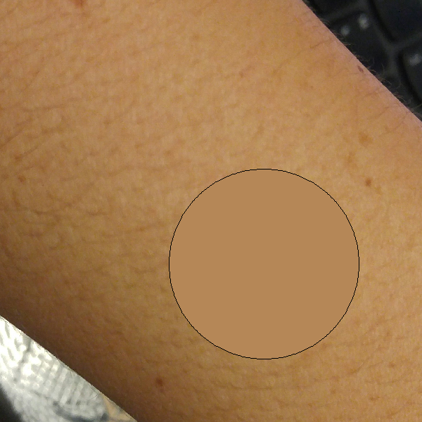
In order to discover whether or not our product supports our design hypotheses, we performed extensive user testing of both the mobile interface and the software. We performed user interface testing using the interactive mock-up for our mobile app by having users go through the simulation and provide feedback. We tested the color-detection and foundation matching algorithms by having users take photos to be analyzed by our software. We evaluated the effectiveness of the code by visually comparing the color of the resulting foundation matches to the user’s skin tone.
User Interface Testing:
Hypothesis: The user interface is easy to navigate
Testing Procedure:
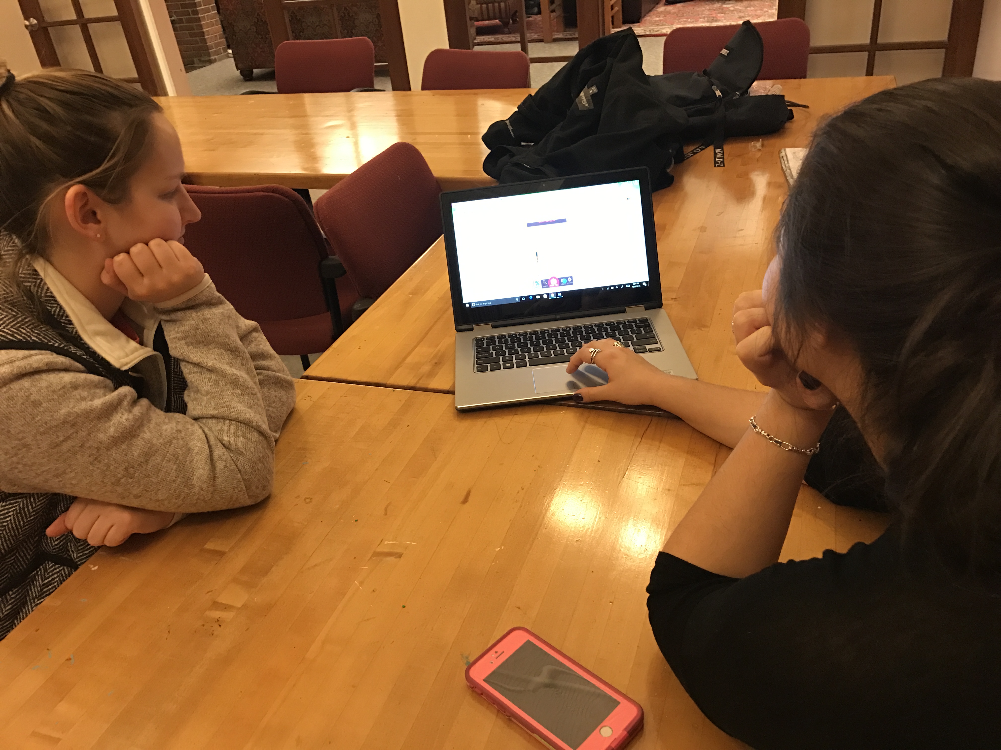
Ask a group of potential users to run through the Invision app simulation. Record user feedback. Observe where users get tripped up to improve the design for future iterations.
Results:
After gathering feedback from 40 undergraduate college students, the following results were obtained:
- Navigating the shade library was not intuitive. Testers did not understand that they could swipe in all directions to view more shades in the library.
- Users wanted options for filtering search results when searching for foundations
- Most of the test subjects thought the information displayed was helpful (percent match, price, location, ingredients, etc)
- Users inquired about what criteria the search bar would be able to take (pantones, color values, brands, shades, etc.
Overall, users were able to understand and navigate the user interface of the app. While the prototyping tool used is limiting in terms of functionality, the user interface was generally well received, and there were very few complaints about the graphical layout of content.
Software:
Hypothesis: The beauty industry has limited available foundation shades.
Testing Procedure:
- Construct a large database of popular foundations
- Have diverse group of users test the app
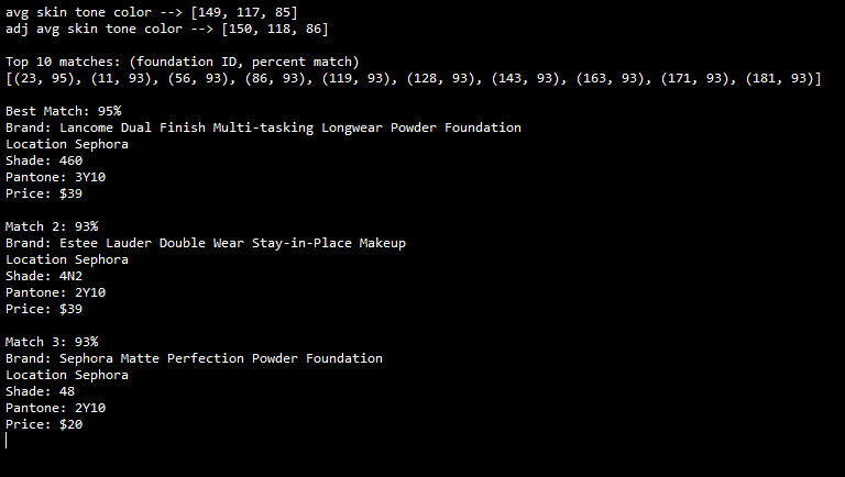
- Calculate top match percentages
- If the top match is below a certain percent, record the skin tone RGB value in a separate table within the database.
Results:
We tested the color detection and foundation mapping software with a test group of 40 individuals. Out of the 40, only 2 people received a top match below 80%, the nominal value that we set for representing an acceptable match. The RGB color values calculated from their average skin tones were then saved to a separate table within the database. The fact that 5% of the test subjects were unable to find a suitable match supports our hypothesis that the beauty industry does not make enough shades to cover the full spectrum of skin tones. The database, which contained over 200 popular foundations of various shades, did not represent the full spectrum of shades, but it did include the most widely available.
Hypothesis: People of color have difficulty finding a suitable foundation that matches their skin tone
Testing Procedure:
- Talk to users who went to professionals to match foundation
- Use working code/app to generate matches
- See if the output is the same as the product/pantone that was recommended by professionals
Results:
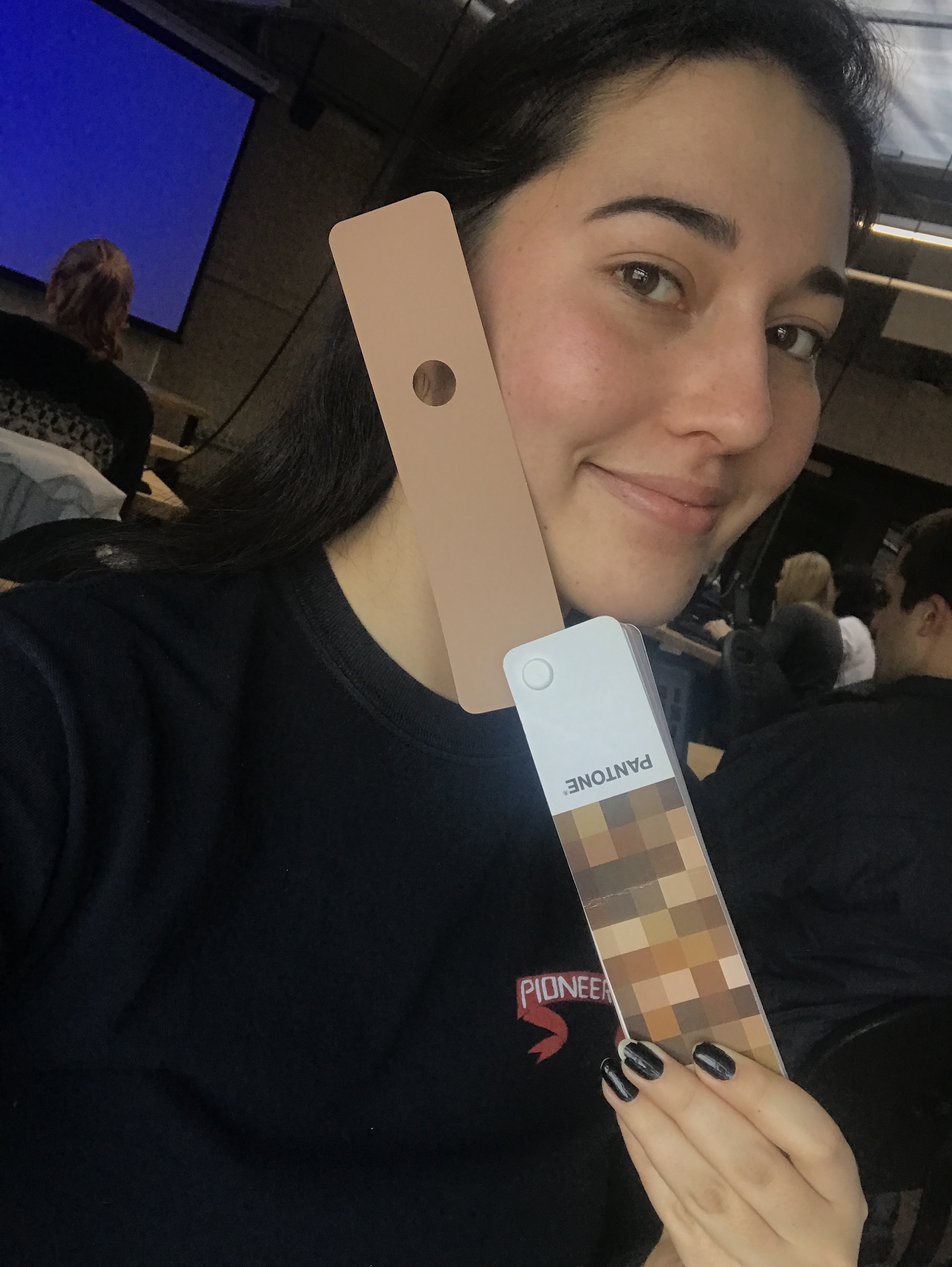
We had 40 users test the color matching and foundation matching code. After the top matches were generated, we took the resulting pantone, and found it within the Pantone color swatch. Then, we visually compared the swatch to the user’s skin tone. When the lighting in the photo was controlled, the pantone generated by the code was actually very close to the pantone that the professional had chosen for the user.
